YOOZ
- UX/UI
- E-commerce
- Wireframes
- Digital barnding
- UI Design
- Prototyping
OVERVIEW
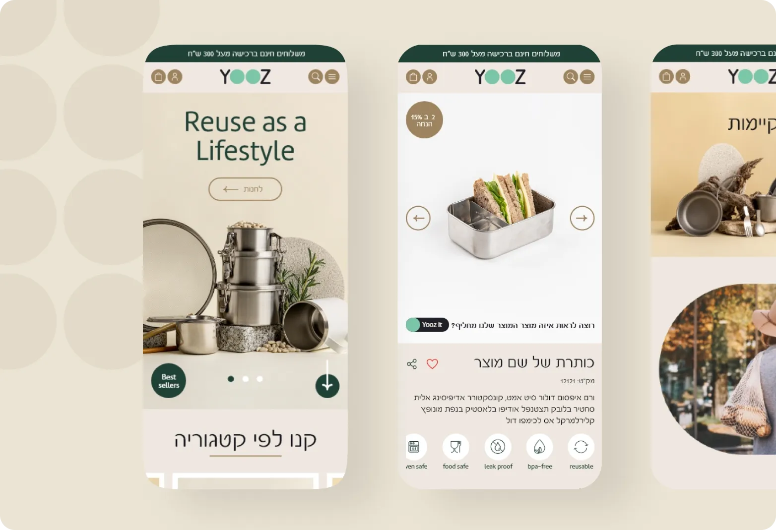
Yooz is not just an e-commerce site; it’s a lifestyle revolution. With a keen focus on sustainability and quality, Yooz offers a curated collection of products made from recycled and environmentally friendly materials. Bid farewell to old habits effortlessly as Yooz becomes your one-stop destination for embracing a high-quality, reusable lifestyle.
Challenge
YOOZ, a nascent player in the recycled products market, faced a significant challenge at the outset. The absence of atmospheric photos and the raw, unpolished nature of the products posed a hurdle. Furthermore, the client sought to introduce innovative features that would convincingly convey the value of opting for recycled products in a positive light.
Solution
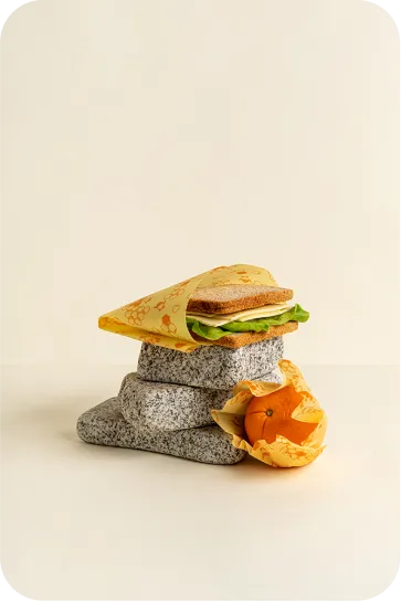
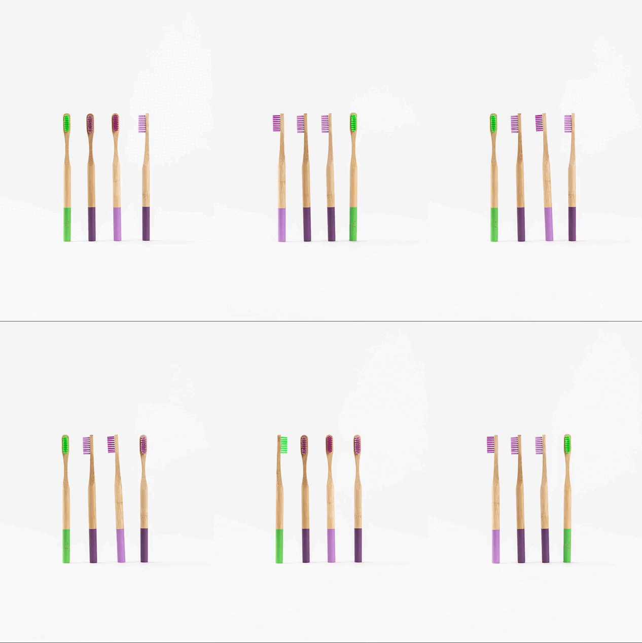
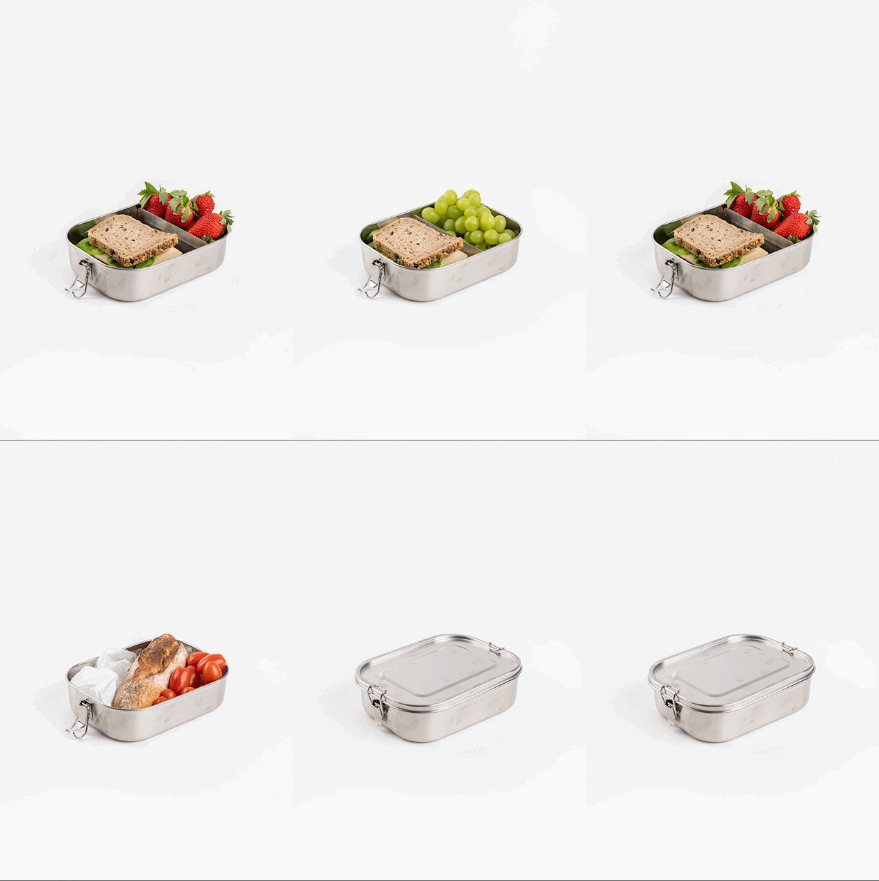
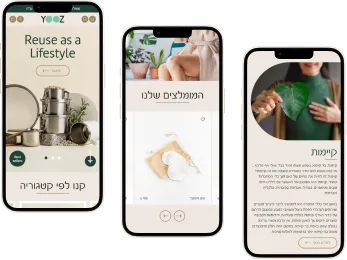
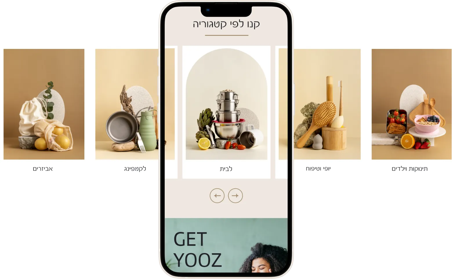
To overcome the absence of atmospheric photos and the raw nature of the products, our solution was to focus on visual storytelling. We embraced a minimalist aesthetic, using high-quality stock images and infusing them with a consistent color palette that aligns with YOOZ’s brand identity. Through carefully selected visuals, we conveyed the journey of recycled products from inception to final polished form, creating a compelling and visually engaging narrative.



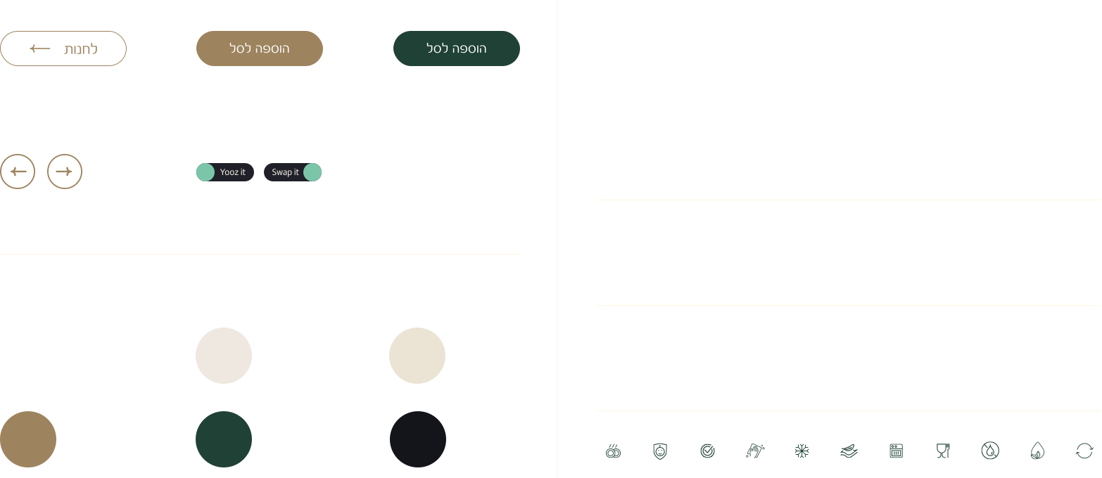
design system
In the meticulous design of YOOZ’s visual identity, the choice of typography and colors was paramount. To infuse the products with an elegant and trustworthy aura, the geometric font Marine was selected, offering a subtle and soft contrast. The running font, Spacer, contributes to readability, harmony, and graphic interest with its clean and precise shape. Furthermore, the color palette of the images draws inspiration from the brand, ensuring a seamless alignment that reflects YOOZ’s commitment to a sophisticated and cohesive visual representation.

Desktop Homepage
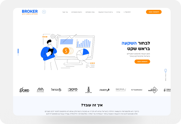
The design concept focused on achieving a modern, professional, and trustworthy aesthetic. To achieve this, a combination of blue and orange was chosen as the primary color scheme. Blue conveys stability, reliability, and trust, essential qualities in the financial and investment sector. Orange complements this by adding a dynamic and energetic element to the overall design.
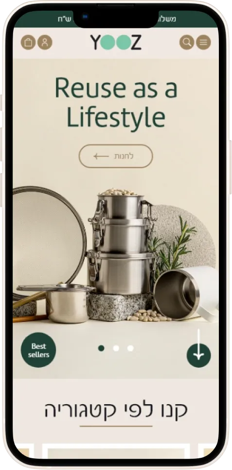
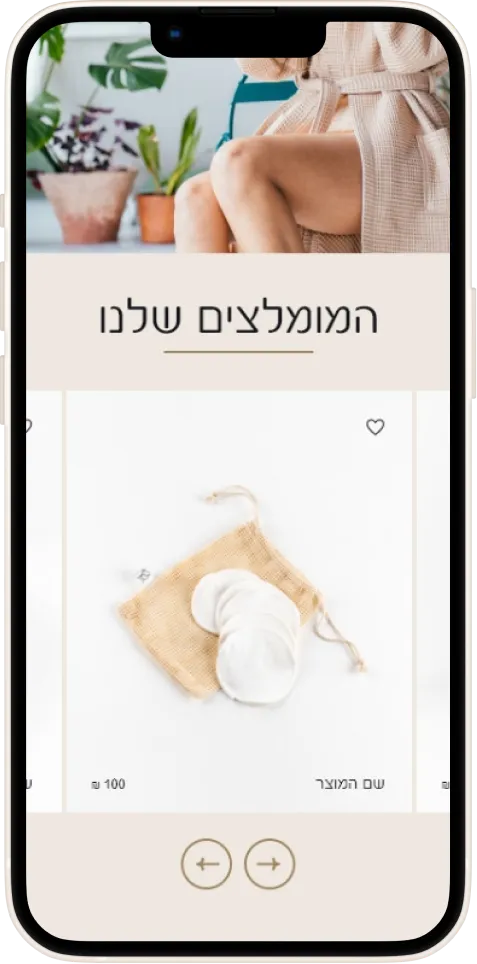
Mobile Homepage
Desktop Product Page
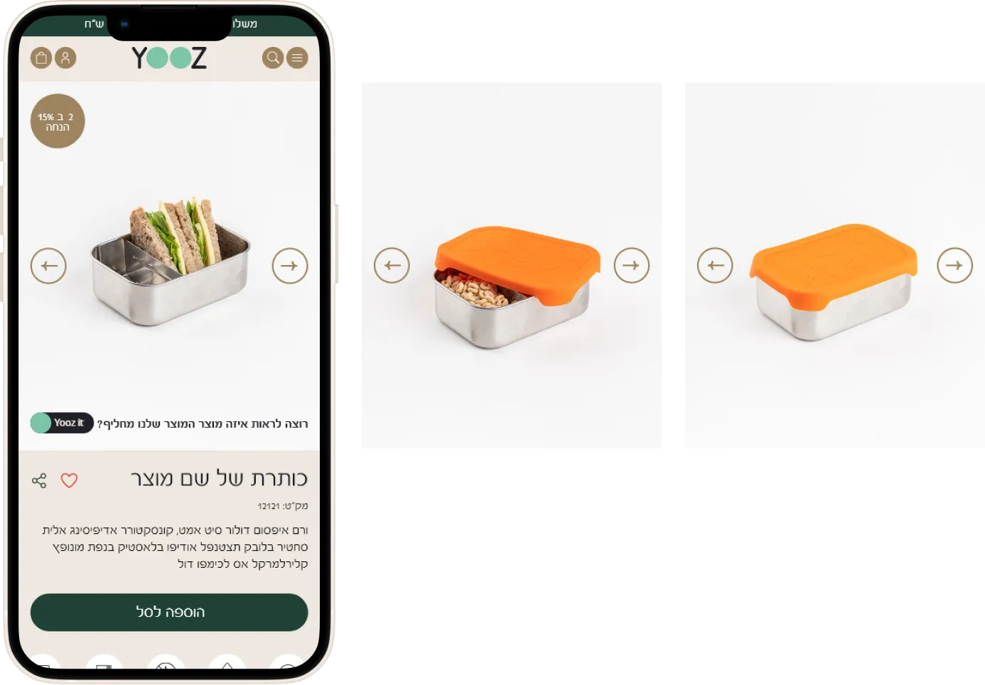
In the product page gallery, a toggle button (“Yooz It” – “Swap It”) has been strategically implemented to highlight the significance of eco-friendly product transformations. This feature, a priority for the client, serves as a visual indicator showcasing products that have been exchanged for their ecological counterparts. Visitors to the site can effortlessly toggle to view these environmentally conscious alternatives, providing a transparent and impactful way to communicate YOOZ’s commitment to sustainability.

Mobile Product Page
Sestainabilty Page
other pages
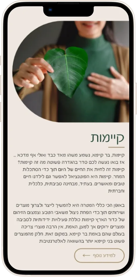
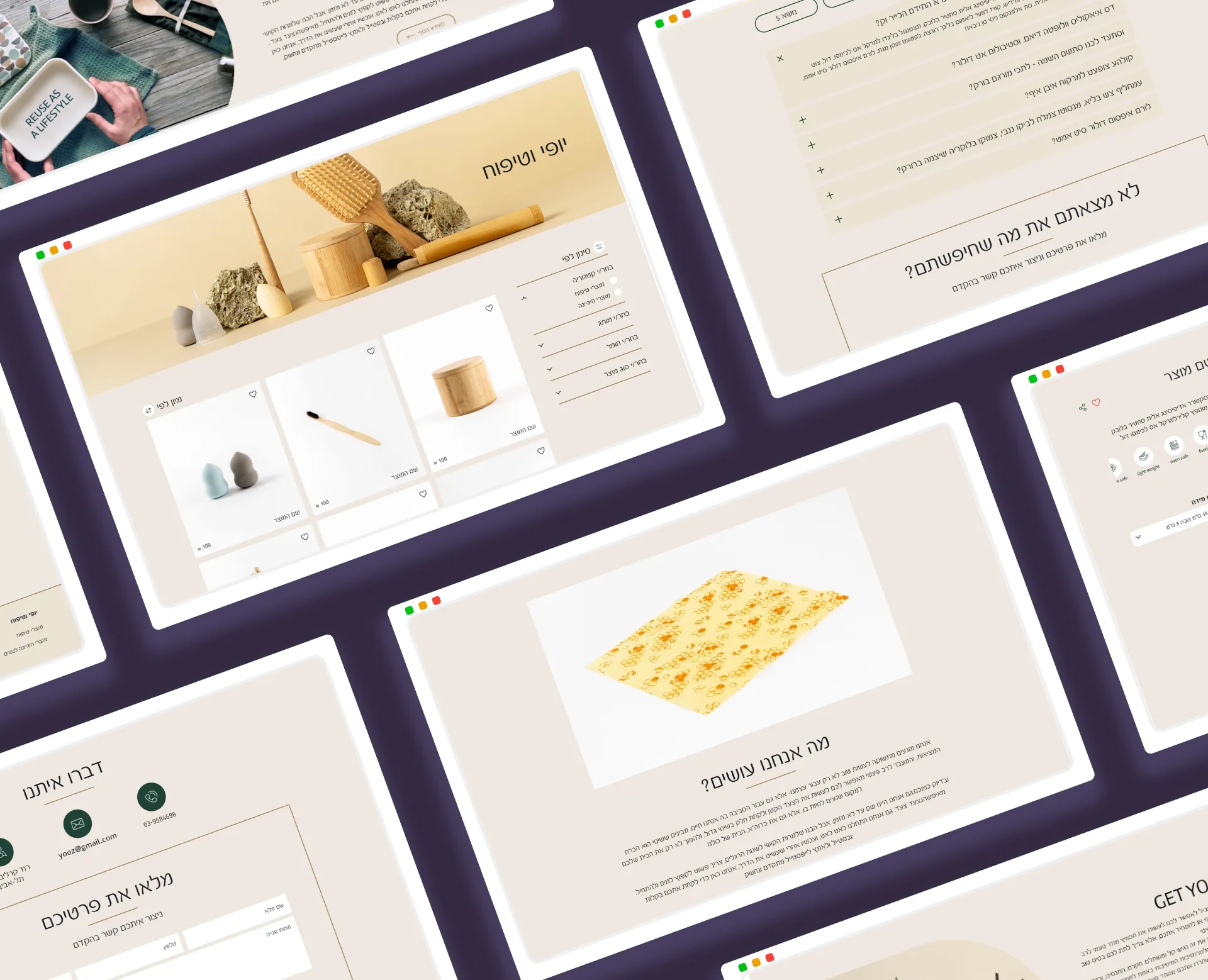
In extending the design language established on the homepage, YOOZ’s inner pages exhibit a seamless continuation of the minimalist aesthetic, typographic choices, and color palette. The user-centric approach ensures an intuitive and engaging navigation experience. Each inner page is meticulously crafted to provide clear information, maintain visual harmony, and sustain the platform’s commitment to elegance and sustainability. The design consistently reinforces YOOZ’s brand identity, making every interaction within the website a cohesive and delightful extension of the overall user journey.
conclusion
YOOZ’s project conclusion is a triumph of sustainability and design innovation. Overcoming challenges, from creating a distinctive visual identity with minimalist aesthetics to introducing a toggle button highlighting eco-friendly swaps, the platform now seamlessly communicates YOOZ’s commitment to sustainability and trustworthiness. The website not only showcases recycled products but also inspires users to make informed, stylish, and sustainable choices, solidifying YOOZ as a leader in the intersection of style and positive environmental impact.