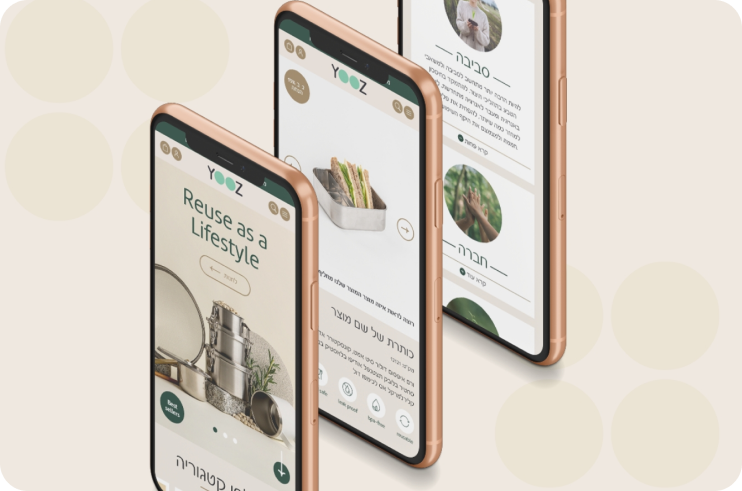
YOOZ-2
- UX/UI
- E-commerce
- Wireframes
- Digital barnding
- UI Design
- Prototyping











OVERVIEW
The “Broker” website serves as a platform connecting customers seeking to invest their funds with suitable investment houses. Acting as an intermediary between clients and investment experts, the site facilitates the process of finding the right investment opportunities. As the UX/UI Designer for this project, my primary goal was to elevate the existing website by implementing a new design and operational practices.
Challenge
The existing website faced challenges in terms of design aesthetics and user experience. The client sought a significant upgrade, focusing on creating a new, polished design with a cohesive color scheme throughout the entire website. The objective was to enhance the overall user experience, making navigation more intuitive and visually appealing.
Solution
The existing website faced challenges in terms of design aesthetics and user experience. The client sought a significant upgrade, focusing on creating a new, polished design with a cohesive color scheme throughout the entire website. The objective was to enhance the overall user experience, making navigation more intuitive and visually appealing.
Colors & Typography
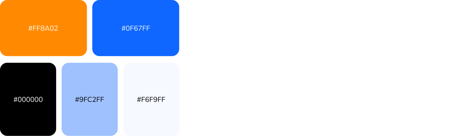
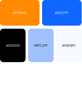
Color Scheme: Implementing the chosen blue and orange color scheme consistently across all elements to establish a strong brand identity.
Typography: Selecting clean and readable fonts to enhance the clarity of the content and maintain a professional look.
Homepage
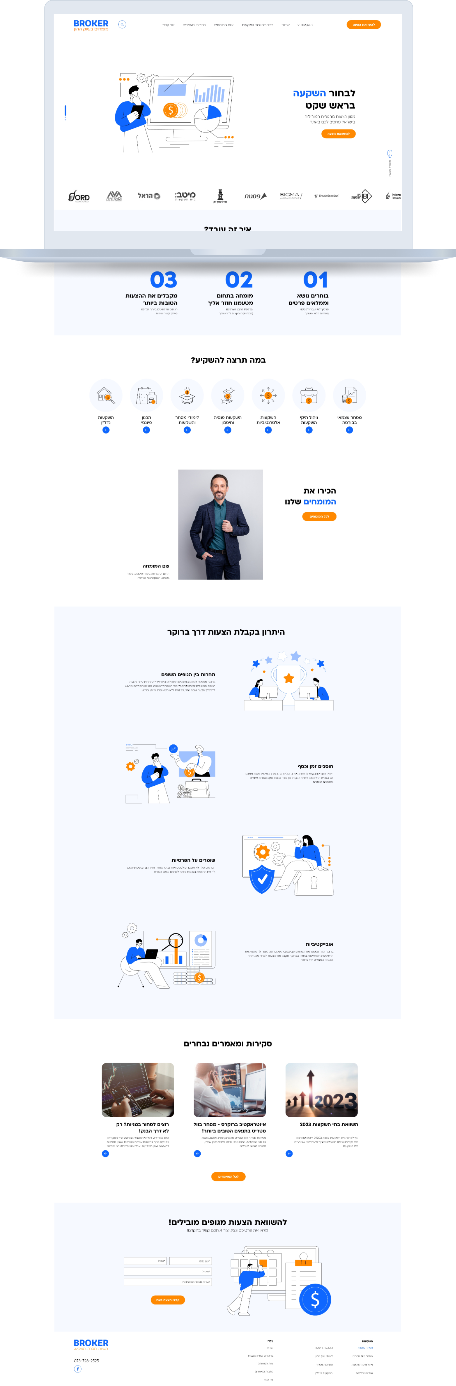
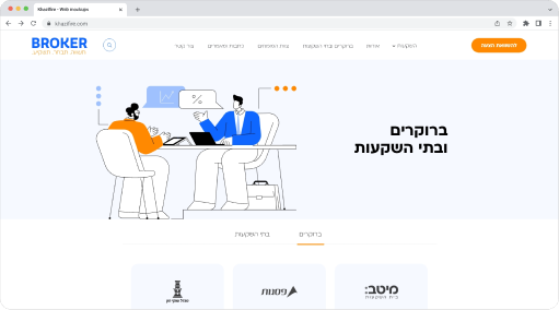
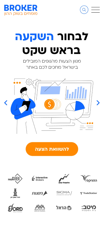
The design concept focused on achieving a modern, professional, and trustworthy aesthetic. To achieve this, a combination of blue and orange was chosen as the primary color scheme. Blue conveys stability, reliability, and trust, essential qualities in the financial and investment sector. Orange complements this by adding a dynamic and energetic element to the overall design.
Usability Testing
In the quest to enhance the “Broker” platform’s user experience, a focused usability testing initiative is imperative. Our goal is to evaluate the redesigned website, meticulously examining aspects of navigation, information clarity, and overall user satisfaction. By recruiting a diverse pool of participants, ranging from novice investors to seasoned financial professionals, and employing key scenarios such as registration, portfolio management, and engagement with investment opportunities, we aim to extract valuable insights. The subsequent analysis of metrics like task success rate, time on task, and participant satisfaction, coupled with qualitative feedback from post-test interviews, will be instrumental in validating the effectiveness of the redesign. This usability testing process serves as a critical checkpoint, ensuring that the platform not only meets but exceeds user expectations, providing a seamless and intuitive experience.
Inner Pages
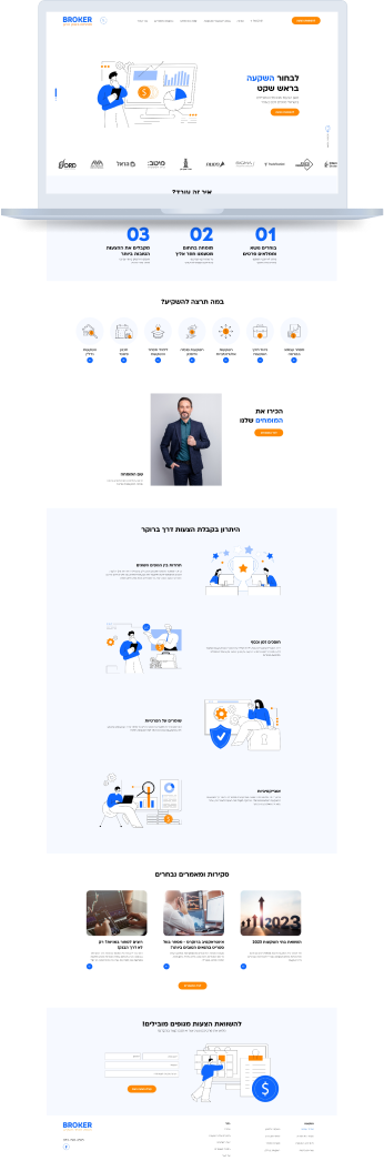
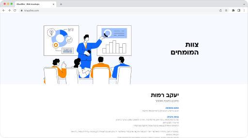
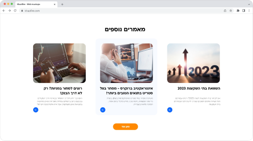
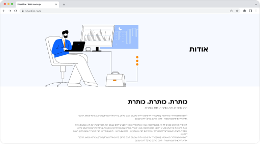
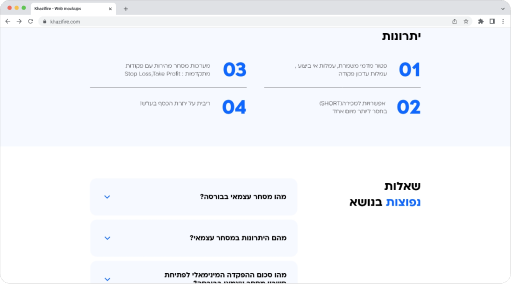
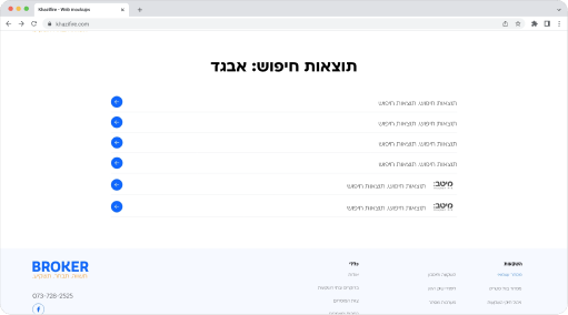
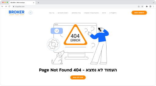
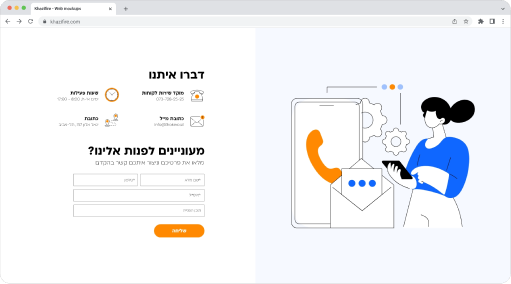
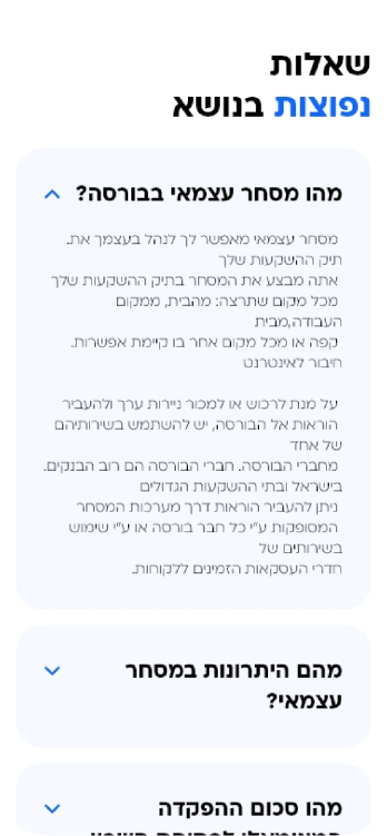
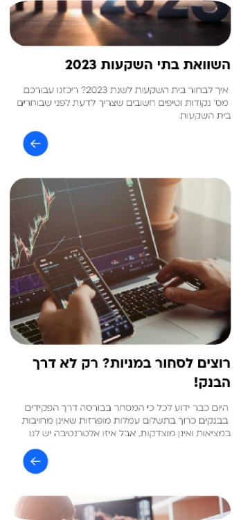
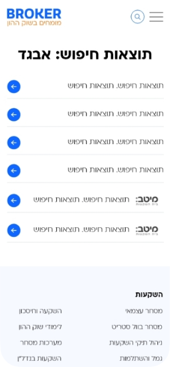
The inner pages of “Broker” echo the clean and engaging design language established on the homepage. Consistency in color, typography, and modern illustrations extends across each page, fostering a seamless user experience. Responsive design ensures adaptability on various devices, while clear navigation and strategic call-to-action buttons guide users through investment opportunities and portfolio management. The inner pages contribute to a cohesive and visually appealing user journey, enhancing the overall user experience on the “Broker” platform.
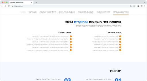
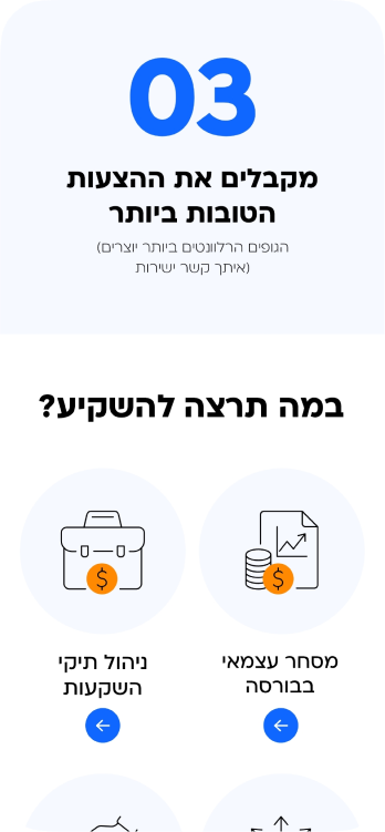
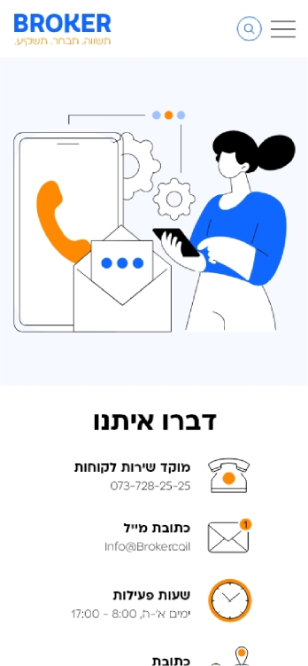
Responsive design


conclusion
In conclusion, the “Broker” UI/UX redesign successfully met the project goals by combining a user-centric approach with a visually appealing design. The iterative process of research, wireframing, design, and user testing ensured that the final product not only met the client’s expectations but also resonated well with the target audience, ultimately contributing to the success of the platform in the competitive landscape of financial and investment websites.